
In the previous post I looked at the possibility of warming accelerating post-2015. However, I did not look at changes in warming at the early part of the 1980–to–present range. It turns out this might be significant, and I discuss why in this post.
Long–Term Slopes
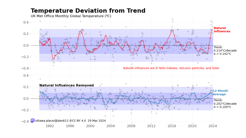
While fitting natural influences (ENSO, volcanic cooling, and solar) to the temperature, I used Locally Weighted Scatterplot Smoothing (LOWESS, also known as LOESS) with a 15–year window to remove local trends from the data. I was mostly concerned about recent warming and cooling, but looking at the curve itself, you can see there is a change from 1980 to 1990.
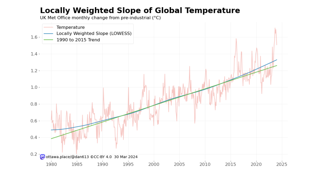
I added a fitted line from 1990 to 2015 to highlight the changes. This indicates that a more faithful representation of modern warming starts at 1990. 1975 might also be good, but many indices start around 1979, the beginning of the satellite era.
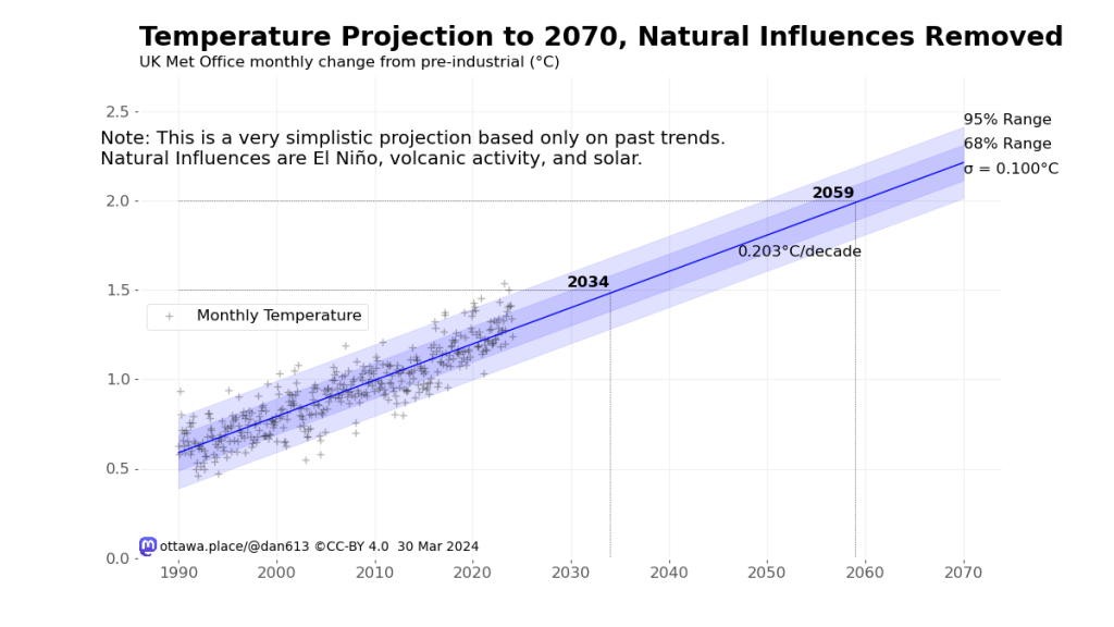
This change caused a change in the estimated slope (with natural influences removed) to go from 0.188℃ per decade to 0.203℃ per decade, with a commensurate decrease in time before we hit 1.5℃ and 2.0℃ above pre-industrial temperature, on average, of 2034 and 2059 respectively.
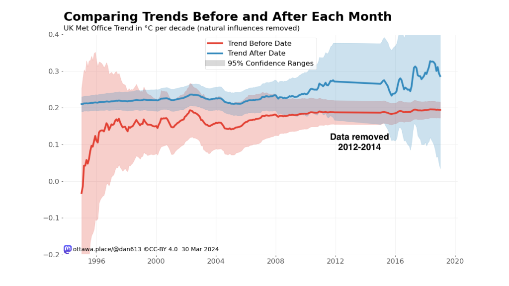
While this decreases the difference between earlier warming and the most recent warming, we can see there’s still a point around 2013 when a change seems significant.
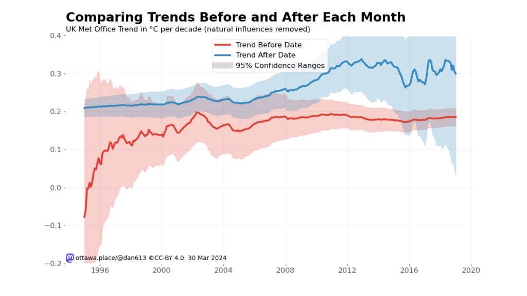
Looking a bit more closely at the residual monthly temperature data, we can see a three-year period from 2012 to 2014 inclusive where the temperature is a bit lower than the trend. Again, starting a new trend in this period will accentuate the change in slope, while starting in 2015 is just barely significant. A Chow test does fail the hypothesis that there isn’t a break in the model, however it doesn’t consider the autocorrelation of the data, and at the moment I don’t know how to correct for that, the way that the slope estimates are corrected in Foster and Rahmstorf (2011). This paper, Sun and Wang (2021), looks promising.
Removing the 2012-2014 Cool Period
What would happen if we simply remove the anomalous cool period? This would increase the overall trend, for one thing, and make the post-2015 warming less significant.
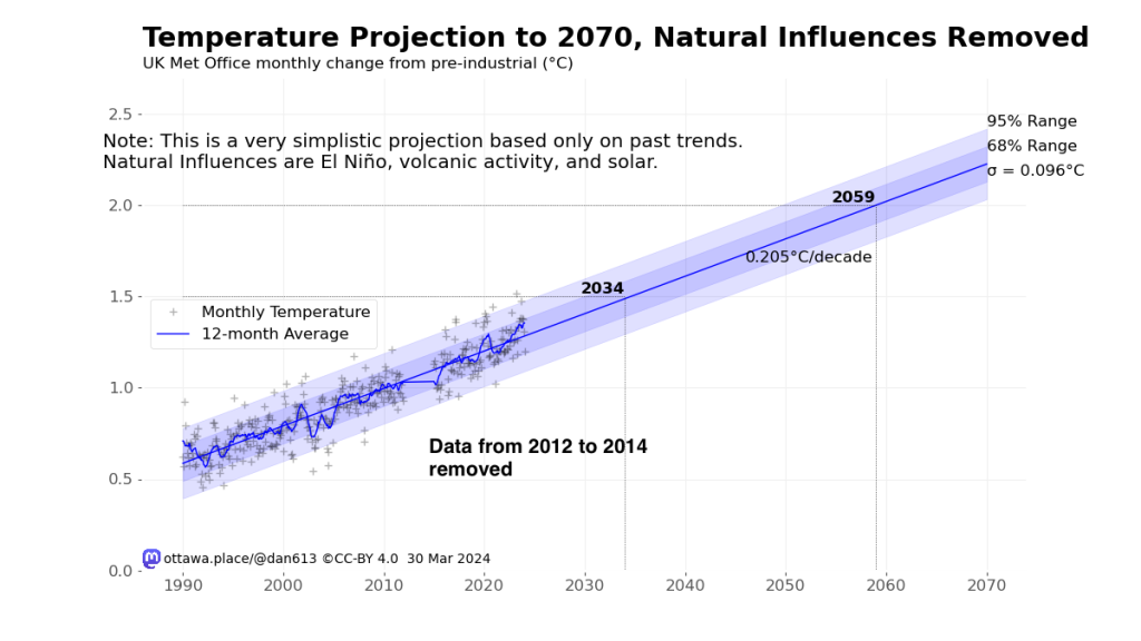
You can see that the change in slope is marginal, moving from 0.203℃/decade to 0.205℃/decade. However, this eliminated any significant slope change.
I am not advocating for ignoring that cool period. But I think it is important to recognize that the cool period corrected itself, and therefore we must consider that the recent warming may also return to the expected trend, barring any additional outside energy trend change. I noted this possibility previously from the Annual Greenhouse Gas Index post–2010.
The Only Certainty Is Change
All the above assumes that we continue on pretty much as before, which of course would be disastrous. I’m confident we are on the brink of declining fossil fuel emissions, and this should make itself evident in about 10 years (due to the ocean heat sink effect).
As before, the Python code for creating these charts are on my GitHub site.

Leave a comment