Global Warming Is Not Accelerating

Is Global Warming Accelerating? No.

Change we can use. Photo by Steve Johnson on Pexels.com

Tomino over at Open Mind discussed the possibility that global mean temperature trend has recently started to accelerate. Although he shows a change in warming trend starting from 2013, he did not calculate how likely this is.

When calculating a trend, you are really just making an estimate. With a least square fit, you are finding the line that minimizes the average squares of differences between the data and the line. The data has a certain amount of variance from this line, and the more variance there is, the more likely there is error in calculating the trend.

Foster and Rahmstorf (2011) developed a method of determining this error which takes into account the autocorrelation of the data. You can also look at an interactive tool over at Skeptical Science or at Professor Kevin Cowtan’s site at the University of York. If you apply it to the data from 1980 onwards, you get the following:

Chart showing the monthly temperature data since 1980, with a trend of 0.197 ± 0.032 ℃ per decade.

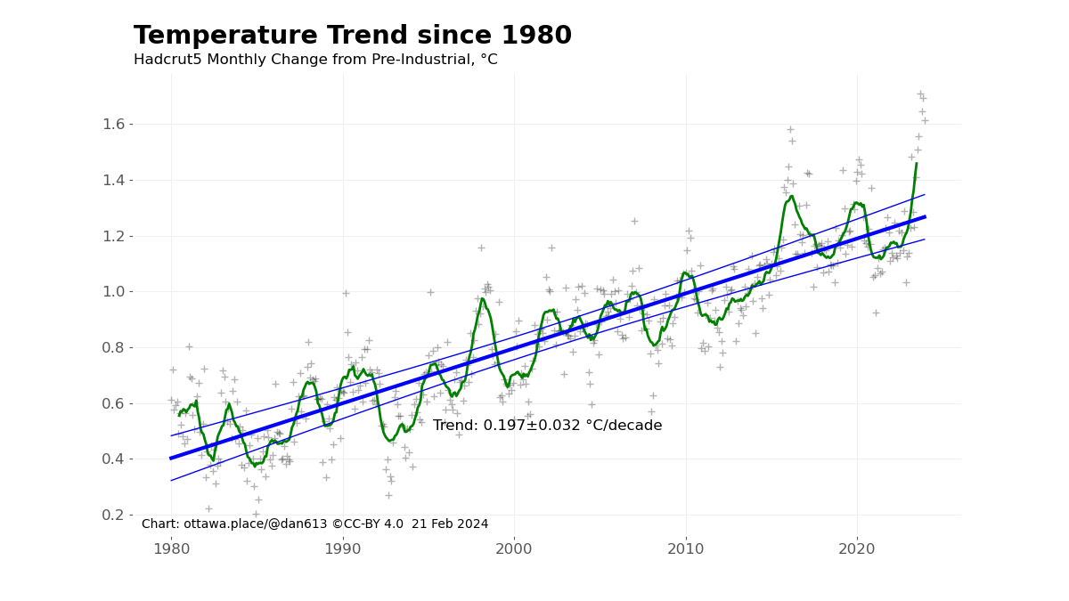
I’ve chosen to use monthly data to avoid arbitrary demarcations, and this is the raw data from Hadcrut5, rather than adjusted to remove natural influences such as El Niño and volcanic activity. With over 500 data points, this provides a fairly well-defined trend. But using fewer points means you are averaging fewer differences, leading to more variation in the likely trend. For example, finding the trend over the last 20 years or the last 10 years results in different trends and range (I’m using the 95% confidence range in all charts).

Comparison of 20 years of data versus 10 years. The 20 year trend has a confidence range of ±0.088, whereas having half as much data results in a confidence range of ±0.268.

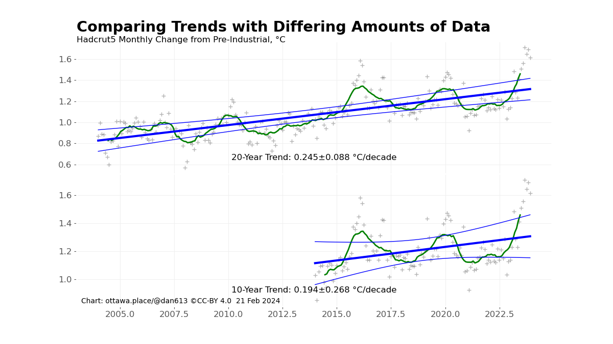
Even though these two sets of data give different trends, the range of likely trends fits within both confidence ranges. Another aspect is where you choose the start and end points. Starting when temperature is higher than the local average will give a lower trend than starting with a temperature is lower than the local average. Similarly for the end points. So one could choose a point that maximizes the difference between the trend before this point and the trend afterwards. However the choice of point also affects the confidence range.

My final chart looks at what happens when you check every data point to see what the slope of lines before and after that point turns out to be. Since the confidence ranges are also calculated, a statistically likely difference is a point where the ranges do not overlap.

Chart showing, for every data point in the set, the tend line before and after that point. Near the ends of the sets there is not much data for one or the other of the trends, so the confidence ranges expand quite a bit.

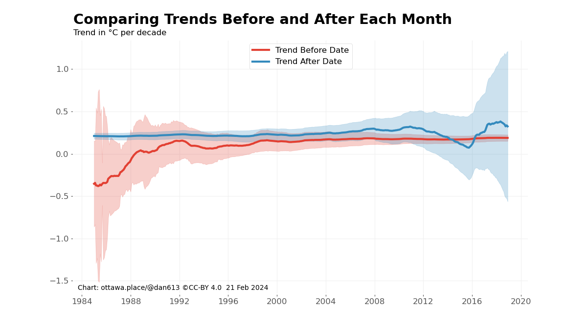
I truncated the dates investigated by five years at the start and end of the data so that there would be a reasonable amount of data for the lines at each side. As you can see, except for a brief span in the ’80s, the confidence ranges of the slopes before every date overlaps the ranges of the slopes afterwards. This means there could be a slope within the overlapping ranges that are within the confidence ranges for both sets of data.

Note again that I did no remove natural influences from this data, which tends to move the data closer to the trend line. Even so, the data shows that it is unlikely that there is a temperature acceleration. And when the next La Niña occurs, I expect the concern will be over.

Of course, we still have the concern of an ever-increasing temperature. Just not an accelerating one.

Note: The data and programs I used to create these charts are over at my Github page. plotRate has the plotting routines, whereas the Trend.py module has the calculations.

5 responses to “Global Warming Is Not Accelerating”

  1. Nice work. 1) Can you repeat the last chart using monthly values with ENSO (and solar though I doubt that makes much difference) influence removed? That should lower the values around 2015-2016 resulting in a steeper slope for the right side of the chart. The resulting blue line would presumably get closer to the ~0.4C/decade for the most recent years.
    2) I am surprised that there is a negative trend prior to 1989. Even though much slower I expected a slow rate of warming even then given that global average surface temperature rise began in the 1970s. But on second thought, the chart just says that there was a negative trend from 5 years before 1984 to 1984, i.e. 1979-1984, 1979-1985….. 1979-1988, then the post-1979 warming trend emerges from the short period without warming 1979-1988 which is embedded in a longer term warming that began prior to 1960. Right?

    Liked by 1 person

    1. Yes, I’ll do another chart removing the influences. There was some volcanic activity at the beginning of the period which would disappear. The starting point makes a difference for positive or negative trends over short spans.

      Like

      1. Beggars can’t be choosers, so I left off also adjusting for aerosols/volcanoes, but you were probably going to do that anyway. And you probably already know about the lags and scaling factors for ENSO. (3-4 month), solar (18 months) and aerosol (7 months) — at least those are values I have.
        But I do have one more request that you might not have been planning to do anyway. The record breaking temperature of 2023 is especially remarkable because most of the ENSO boost is expected to show up in 2024. And Jan and Feb 2024 temperatures are in accordance with that. Plus 2024 is another step closer to the solar max, and I suppose if there is any change in aerosols it might lower (thus a third factor for more warming in 2024 vs 2023), plus of course another year on the rising GHG escalator. All told then it reasonable, even conservative, to assume that 2024 will be at least as warm as 2023. It would great to see your rate curves with a 2024 estimate included to add another year to the trend. It’s just one year, but it would double the number of 1.4 to 1.5 C years from 1 (2023) to 2 (2023, 2024), so it could have an appreciable effect on the result in addition to adding another data point and giving a more recent final 5-year rate value (though true that the final year would be a guestimate not a data point). Or do both just see how much different it makes. I agree with Hansen that 2023 is not a fluke, it is the new baseline and accelerated warming is already established. Either way, thanks for anything you can crank out. An acceleration in the warming rate is an existential issue for human civilization (not the planet, the planet will be long after we are gone) that is not getting enough attention.

        Like

      2. I do cover some of those issues in a previous post: https://dmn613.wordpress.com/2023/11/20/more-details-on-sep-oct

        Like

  2. […] my previous post I claimed that global warming showed no statistically significant signs of acceleration. In this […]

    Like

Leave a comment