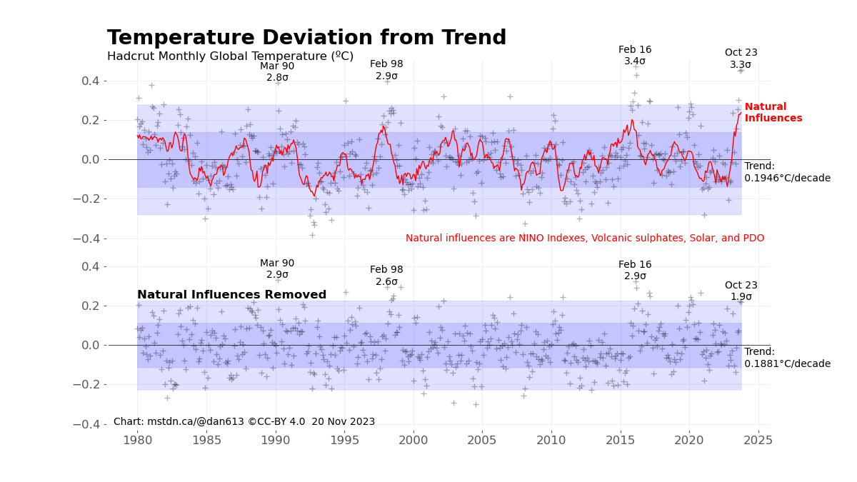
The last post gave a chart showing monthly temperature deviations from the trend:
In this post I want to add more details on the Natural Influences. These were calculated from:
- an ENSO (El Niño Southern Oscillation) index (more on that later),
- a volcanic sulphate index (calculated from the NASA GloSSAC data and surface albedo),
- a Total Surface Irradiation (solar) index based on Dewitte, Cornelis and Meftah (2022), and
- the Pacific Decadal Oscillation (PDO).
These values were then fit to the temperature data using a Least Squares fit. This produced a fit with an R² value of .66 (max 1.0), indicating that the variance in the natural influences account for about 66% of the variance in the detrended temperature. Each component above has a different amount of fit to the data, though, which I show below:
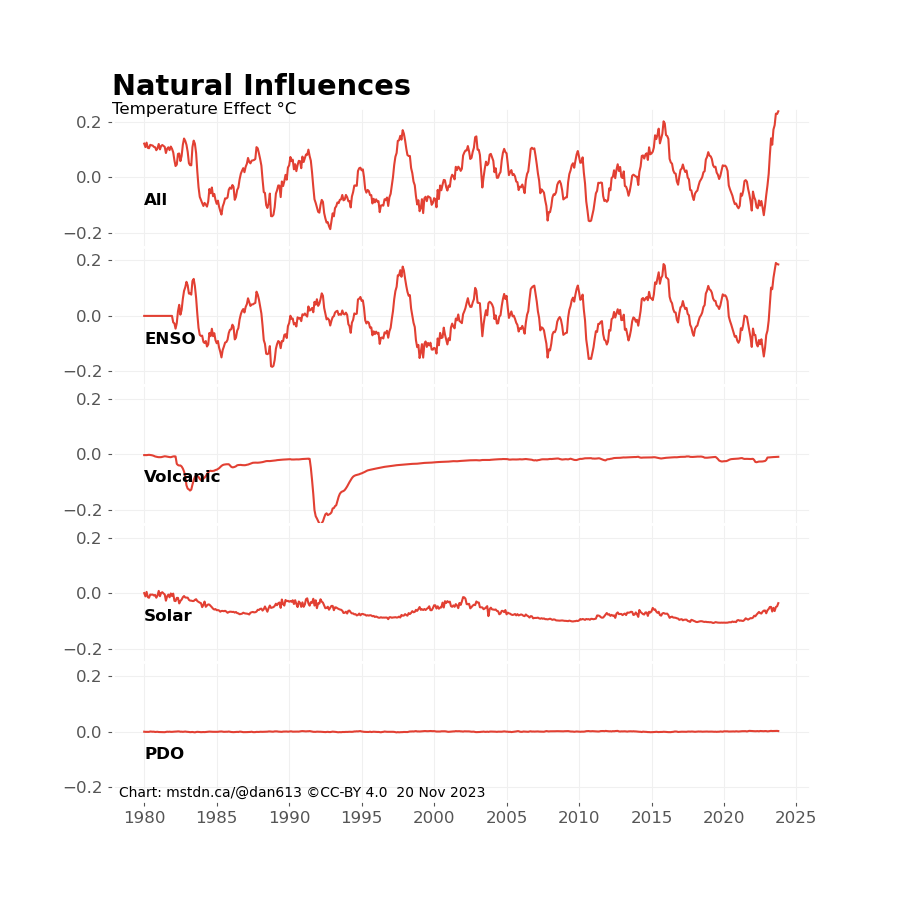
ENSO and the volcanic sulphate emissions show the most influence on temperature with up to around ±.2℃ each. The sulphate emissions only cool the surface by reflecting sunlight, so it is negative after large volcanic explosions. The PDO showed no discernible influence at all.
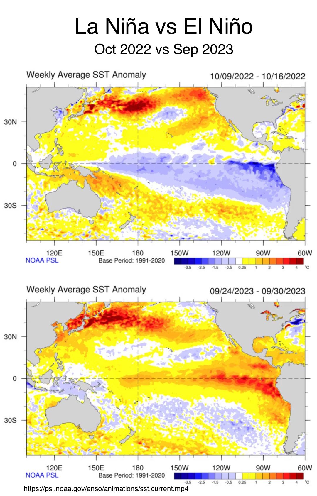
The El Niño Southern Oscillation is a measure of how a section of the Pacific Ocean switches from being cool or colder than average to warmer than average. This happens when the East to West trade wind slows down, allowing warm water to build up off the coast of Peru in South America. This also prevents the ocean from absorbing some of the available solar energy that it normally does.
The ENSO index I used is a composite index. There are 4 available indexes available from NOAA, each representing a different area of the Pacific Equatorial Ocean area. These are shown below:
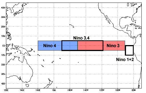
All 4 indexes were fitted to the temperature and provided different levels of influence, as shown here:
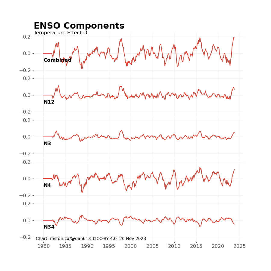
Surprisingly, even though the Nino 3.4 index is the preferred index for describing phenomenon, its fit is negative with Nino 4 and 1.2 having more impact.
One more detail I’ll describe in a later post: external forcing (in this case solar and volcanic emissions) take time to show up in the temperature record due to the massive heat sink that are the oceans. This warming curve was applied prior to fitting the data.
All code used to produce my charts for this post are on my GitHub page: https://github.com/dneuman/Projection/blob/main/projection.py. The main routines are plotTempVars() and plotInfluences().

Leave a comment